
There are oodles of blogs that cover tactical tips for improving UX/UI.
However, designing and building great websites that don’t cost the earth, whilst still giving a great user experience needs a shared approach, involving both designer and web developer.
In this blog post, I’m going to cover some top level heuristics based on our experience of working with designers on many projects.
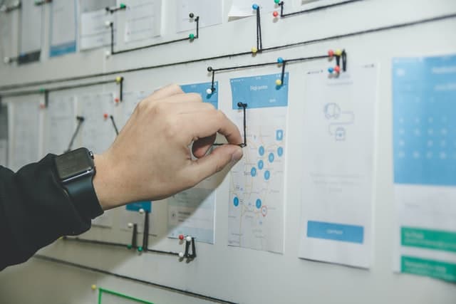
We come across this challenge fairly regularly – a designer has crafted a beautiful piece of digital perfection at 1440px (and to be fair, often at 375px) width. However, problems occur when they haven’t considered that screen sizes are endlessly changing.
When we receive the designs, we raise questions about screen sizes – particularly things like; will elements get too squashed at 768px, or spread too far apart at 1920px?
Taking these things into consideration at the start will save you a lot of time!
ALSO – don’t forget about device interactivity; an iPad Pro’s screen is as wide as the smaller Macbook Air’s but, because it is touch screen, there is no hover functionality. How would the beautiful drop down menu work, when your visitor cannot hover?
Now, I’m absolutely not saying developers need designs for every possible screen size – that would be madness. But considering what might look or act a bit weird beyond a standard desktop or mobile experience will save time and (ultimately) money in the long run!
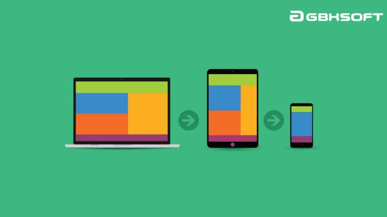
(Image from GBKSoft)
There seems to be a perception that accessibility and performance (site speed, etc) are entirely a technical challenge to be overcome. This actually couldn’t be further from the truth; they are at least 60% a designer’s responsibility.
It’s almost impossible for us to make an inaccessible design accessible.
In the same way, we cannot make an asset-heavy website fast (well not strictly true – we absolutely can – but invariably the end client has not signed off the budget required to do this)
If you want to meet WCAG 2.1 AA standard (“the Web Content Accessibility Guidelines are part of a series of web accessibility guidelines published by the Web Accessibility Initiative of the World Wide Web Consortium, the main international standards organization for the Internet” – Wikipedia), there are some important decisions to be taken at the design stage:
Particularly now that Google have a new focus on user intent and experience in search results, performance considerations must start at the design stage:
This is something we can help you with whilst you’re still designing – we have an agency client who books in an “animation session” during the UX/UI design phase. This is a chance for us to discuss their animation inspirations against the client budget or timeline. It’s a super helpful meeting because it makes sure the end client isn’t surprised to find that work requires more budget/time/can’t be done once we quote for the development.
We’re moving into a world that is increasingly aware of its responsibilities to the environment. This is making sustainability in web design and development an important consideration going forwards. Sustainability also aligns very closely with performance goals – increasing website speed is clearly linked to reducing power consumption from a website:
We made the move to using Gutenberg, WordPress’ modular page editor, early after its launch and have seen huge benefits from using this tool. We really like the flexibility it gives clients to make new pages and blog posts (for example), all while maintaining brand coherence. Each block is structurally fixed but all content is editable, meaning no “creative license” can be taken by content teams – something I think you’ll appreciate as a designer!
Using Gutenberg also helps to lower web development costs – building 10 modules is cheaper and easier than building 6-8 templates!
All this Gutenberg hype is actually leading somewhere, promise.
The biggest thing you can do to improve UX, both visually for the user (but also for your developer) is using coherent, consistent components – don’t treat each page as a standalone experience. This is where getting to grips with designing for Gutenberg could really help you.
Some things to be especially conscious of:
Okay, I know this one is a tough one.
Don’t get me wrong, we love Awwwards (and the other web awards websites) as much as the next person. They are an amazing place to gather inspiration and to explore ideas, the Pinterest of web design.
But.
It’s super important to be mindful of the budgets behind these truly outstanding projects. They are often “budget no limit” or a zero budget because they were a passion or an internal project.
Consider whether the small manufacturing client you have really needs that amazing animation that the freelance front-end developer used on their portfolio website…
Bottom line: Honourable Mentions and Sites of the Day on Awwwards are great inspirational examples as they tend to be more quotidien in their design and animation approach. However, think of the creative effort required to win a major accolade on a website of people who look at websites all day…
Very often we see designers who start with the sitemap and break it down into a series of screens, for example an ‘About’ template then a ‘Contact Us’ template.
However, as user experience becomes increasingly important, it is much more powerful to think in terms of user flows.
This ensures you don’t miss any key templates that might not surface on a sitemap. Some things to consider:
We have many clients who ask us to look over the wireframes, highlighting any top level issues and/or raising any missing designs (such as a legal template, 404, etc) – we’re always happy to help during the design process and we don’t charge for this kind of consultation!
Please get in touch – ben@lattimoreandfriends.com – if you have any questions.
User flows also allow for a greater design coherence around related user flows. For example:
Designing for user flow will help you to create a more cohesive website and avoid last minute rushed designs!
We love to chat around ideas, inspirations, challenges and opportunities for potential web projects. If I’m honest, it’s the part of my job I really look forward to! Please get in touch if you have some ideas you’d like to run through.
.webp)


